
The next step on this course is to develop an app, specifically one that measures accelerometer data which can then be analysed in the last module of the course.
One step at a time though, I’ve got to learn the basics of programming with React Native first. I have some previous experience with other programming languages, but nothing very in depth, so hopefully it won’t take too long to pick up the basics.
Hello World!
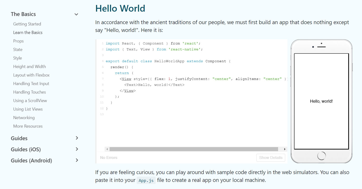
As with any programming language, the first thing covered is writing “Hello World!”.
Initially, I thought “Oh, it uses HTML”. Nope, that’s JSX (XML embedded within JavaScript). It is similar to HTML, as it is another markup language, but in this case this it uses React components (i.e. <View> rather than <div> in HTML).
To understand what is going on here, let’s break it down:
import React, { Component } from 'react';
import { Text, View } from 'react-native';
The code begins by importing the relevant components that will be used in the file and stating where they are being imported from.
export default class HelloWorldApp extends Component
This creates the class “HelloWorldApp” by extending the class “Component”. This means HelloWorldApp will inherit the features in Component so it can be built upon. export means that this class can be exported and imported into another module. export can be used with multiple variables, but export default will only export one variable.
render() {
    return (
      <View style={{ flex: 1, justifyContent: "center", alignItems: "center" }}>
        <Text>Hello, world!</Text>
      </View>
    );
  }
}
This tells the app to render the words “Hello, world!” with some input on its alignment and position. flex invokes flexbox behaviour which helps create a structure whilst letting the elements be dynamically sized to accommodate various screen sizes and dimensions.
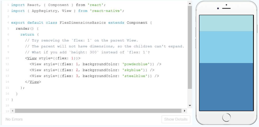
To demonstrate the flex properties, I’ll add some more text in:
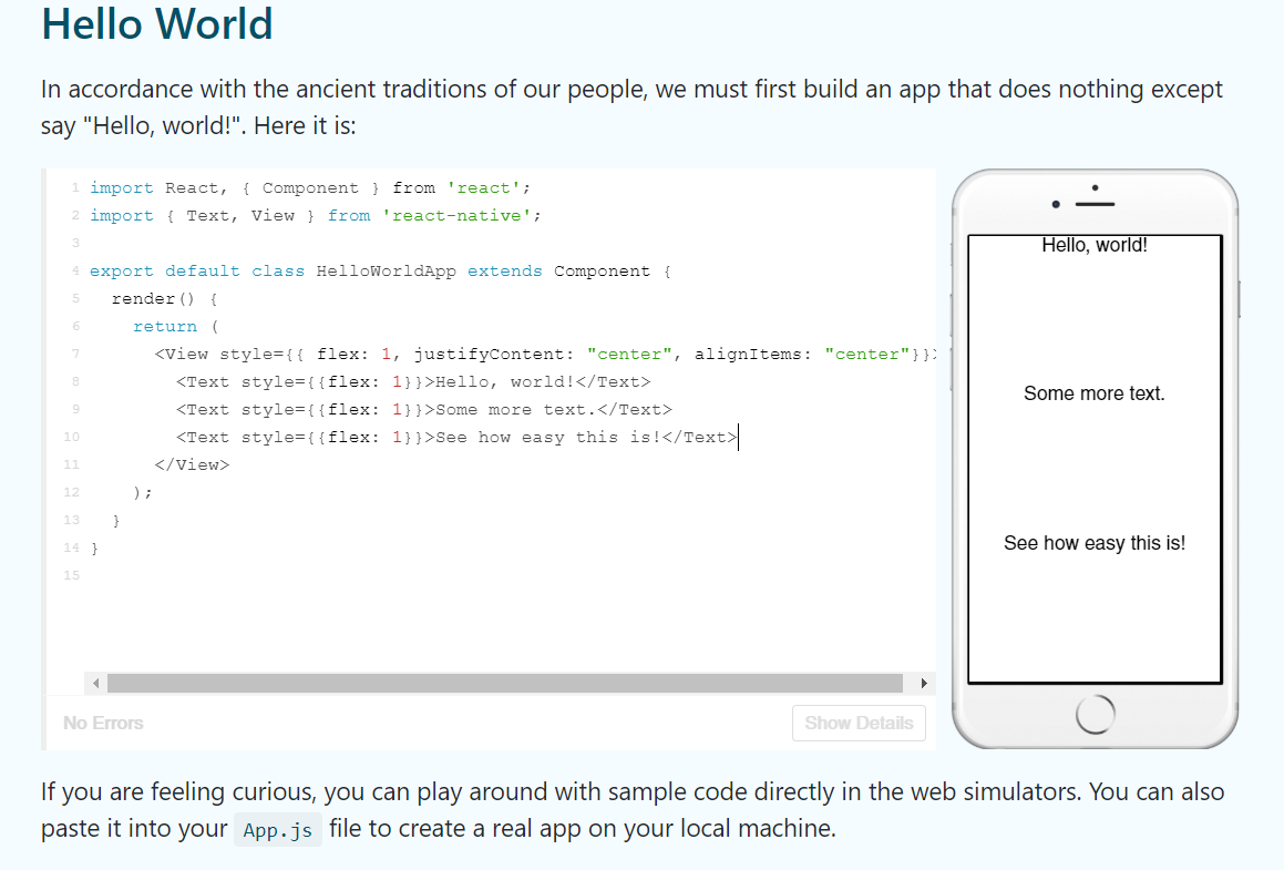
Here I’ve added some more text, but I’ve given them all flex properties. Basically, the number following each flex property states the relative weigth of each element, so by making them all 1, they are all the same size relative to each other, so only take up one third of the screen each.
Also, as you may have noticed in the picture above, the JSX elements must be opened and closed. Let’s see what happens if I delete the </Text>:
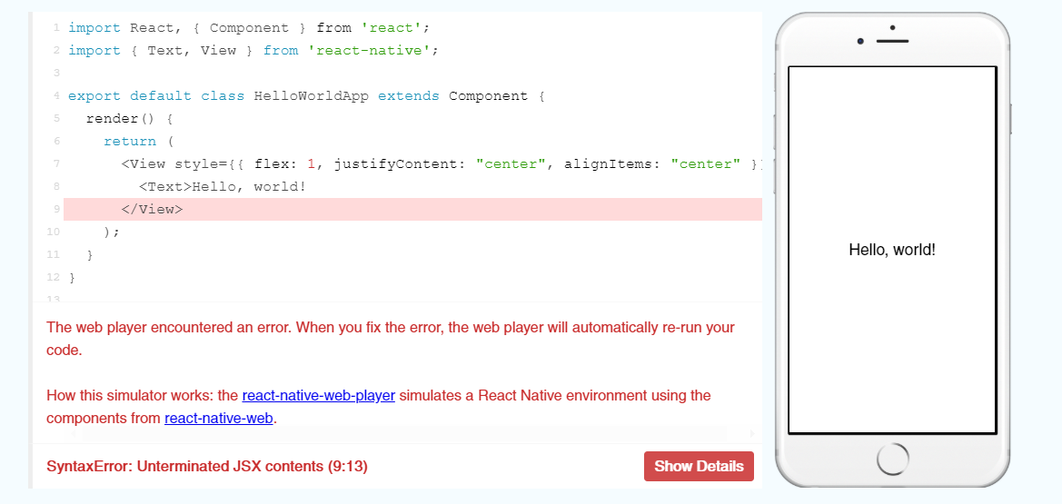
Sure enough, it comes up with an error! It kindly tells you what the error is and where to look, which will come in handy when I start programming the app.
Props
Props, short for properties, are parameters passed to a component that customise the component. In the following example, source is a prop of Image that controls the image shown.
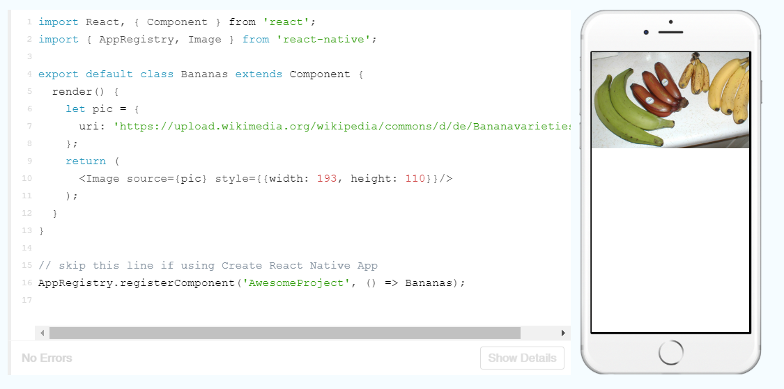
Having images from URL’s makes them very easy to change, like in the following:
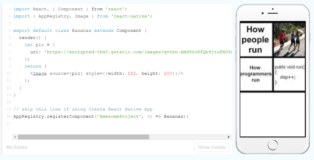
However, it seems that the width and height have to be manually set currently. This is a bit finicky, so hopefully I will come across an easier way to automatically set the image dimensions later on.
When a single component is used multiple times in an app, you can also use props to slightly change the properties each time. The following is an example of this:
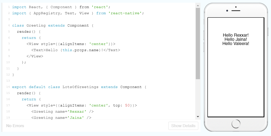
Here, the first class Greeting is setting up a template for the greeting and a prop is being used in place of the name. The names are then populated in the LotsOfGreetings class (which the Facebook team just so happened to give a Warcraft theme!). I should be able to just add more names to render more greetings on the app:
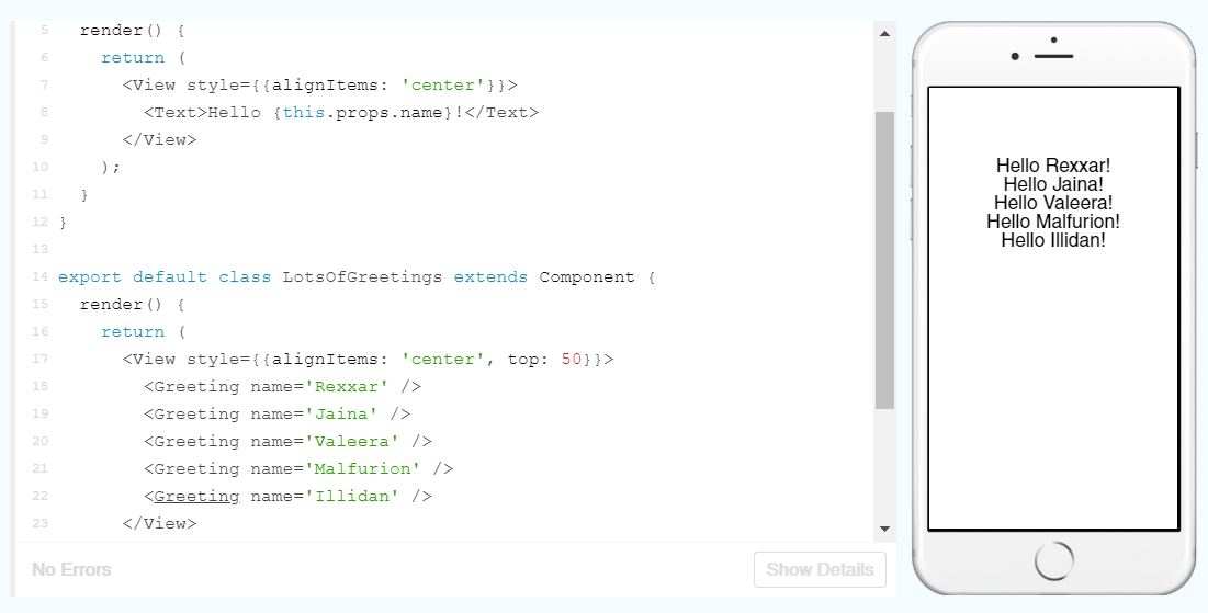
It’s as easy as that!
State
Props are static. If we want things to change, we need to make use of state.
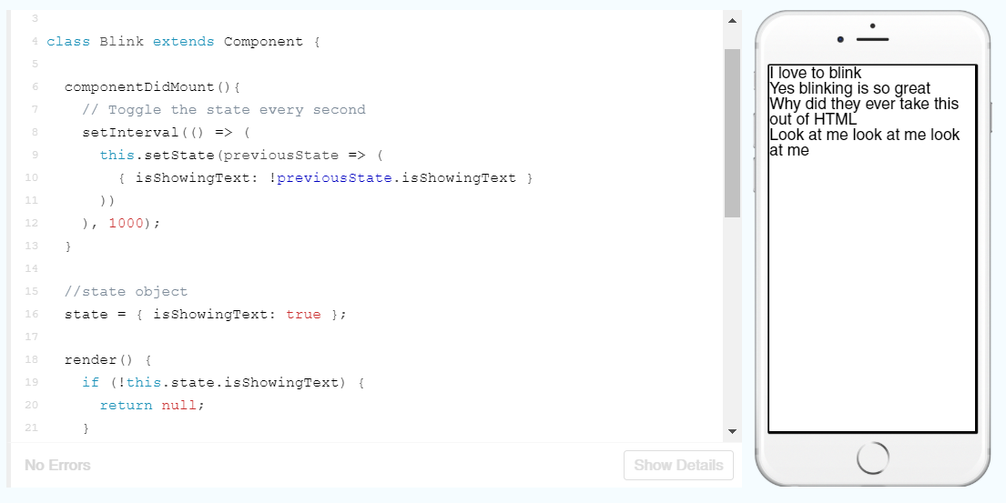
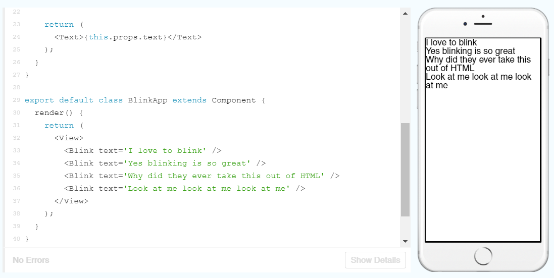
In this example, the class Blink is being used to set the state of the props text set in the class BlinkApp. Sounds confusing, so lets break it down:
setInterval(() => (
      this.setState(previousState => (
        { isShowingText: !previousState.isShowingText }
      ))
    ), 1000);
setInterval takes two arguments, a function and a time (in milliseconds). The function setState is calling the previous state and setting the isShowingText variable to the opposite state. The specified time, is the interval between every time this piece of code is run and the state is changed (currently 1 second). We could modify this to increase or decrease the interval.
state = { isShowingText: true };

  render() {
    if (!this.state.isShowingText) {
      return null;
    }

    return (
      <Text>{this.props.text}</Text>
    );
  }
}

export default class BlinkApp extends Component {
  render() {
    return (
      <View>
        <Blink text='I love to blink' />
        <Blink text='Yes blinking is so great' />
        <Blink text='Why did they ever take this out of HTML' />
        <Blink text='Look at me look at me look at me' />
      </View>
    );
  }
}
The rest of the code is setting the initial state and then deciding the output based on the state. The exclamation mark means NOT (i.e. !true == false), so if state.isShowingText is false, it will return null and nothing will render on the screen.
However, if the state is true, then it will return the text specified in the class BlinkApp.
Style
In React, you can styles using the prop style which is analogous to CSS styles.
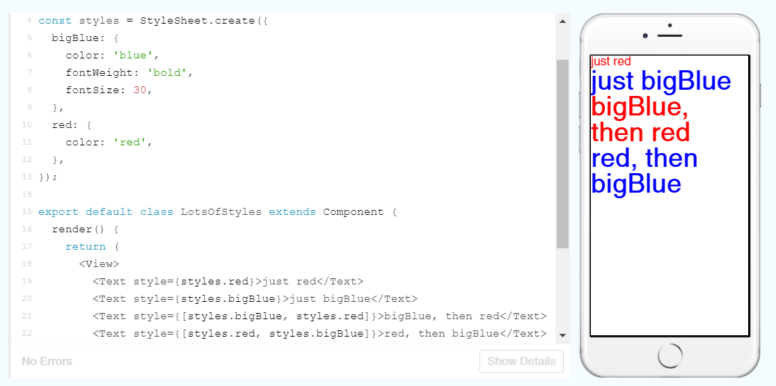
Using a StyleSheet to define the styles and subsequently use these in the text makes for easy designing. A few changes to this StyleSheet and updating of names within the Text elements and we can change the colour, weight and size of the fonts.
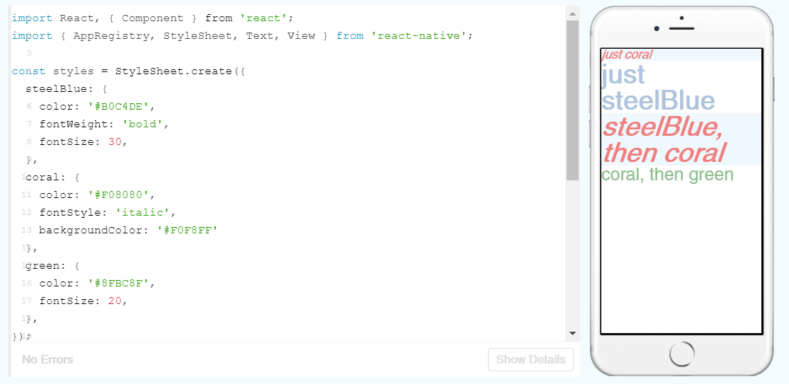
As you can see, I’ve also made use of some other properties such as fontStyle to set the red text in italics and backgroundColor to change the colour behind the text.
Height and Width
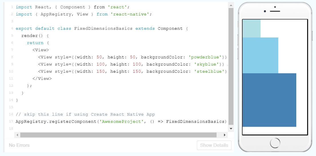
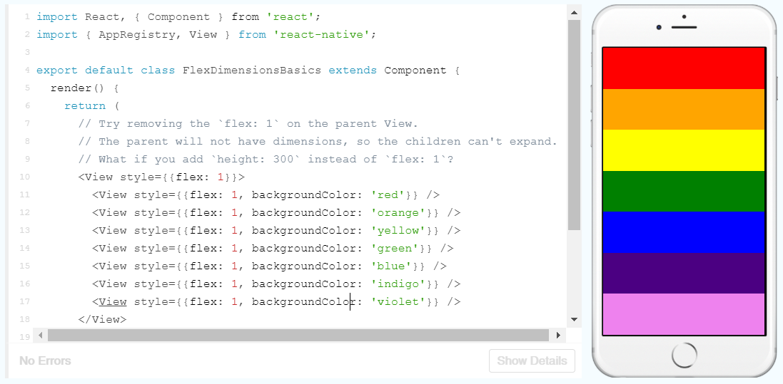
As you can see here, the width and height have specified dimensions. This is useful for components such as images, that should always render at the same size. Otherwise, we could dynamically set the height using flex:
This allows for some easy customisation:
Unfortunately, being very specific like programming languages are, the syntax uses American spellings like ‘colour’ instead of ‘colour’, which caught me out when creating this initially.
That’s enough programming for now, I’ll pick this back up in Part Two!
 Understanding Digital Health