
Carrying on from Part One, there are yet more intricacies to layouts and flexboxes to work through, followed by learning how to handle text inputs.
Component Layout and Flexbox
As you may have noticed in the example above, to dynamically change height with flex we lost the ability to affect the width of each colour. Using some of the other properties included within flexbox, we can adjust width, alignment and create rows so that we could have more than one colour next to each other.
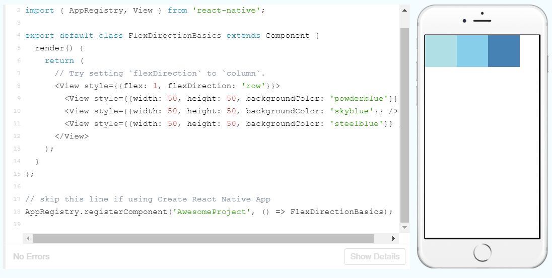
Here, the flexDirection property is set to row allowing more customisation of the layout. Let’s play around with this:
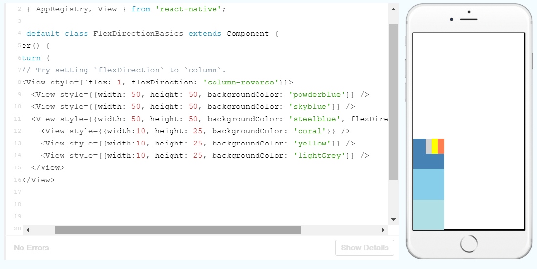
Here I’ve switched the direction to column-reverse, which also appears to reverse the alignment on the screen as well as the order of the boxes. Then I set up some new coloured boxes inside the blue box and set them to row-reverse. As you can see, you can start layering items up and overlay other items, which could come in handy.
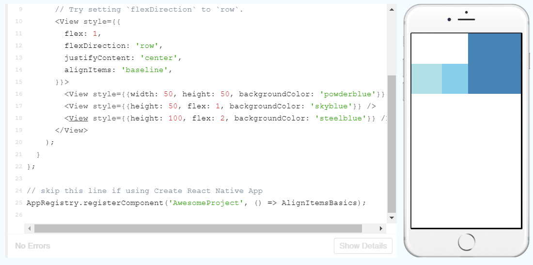
But what if we want to align the boxes in a different way upon the page? That’s where the justifyContent and alignItems properties come in. justifyContent describes the alignment of children (elements nested within another) within the main axis (left to right for rows and top to bottom for columns) a component, whereas alignItems describes the alignment in the cross axis (perpendicular to the main axis).
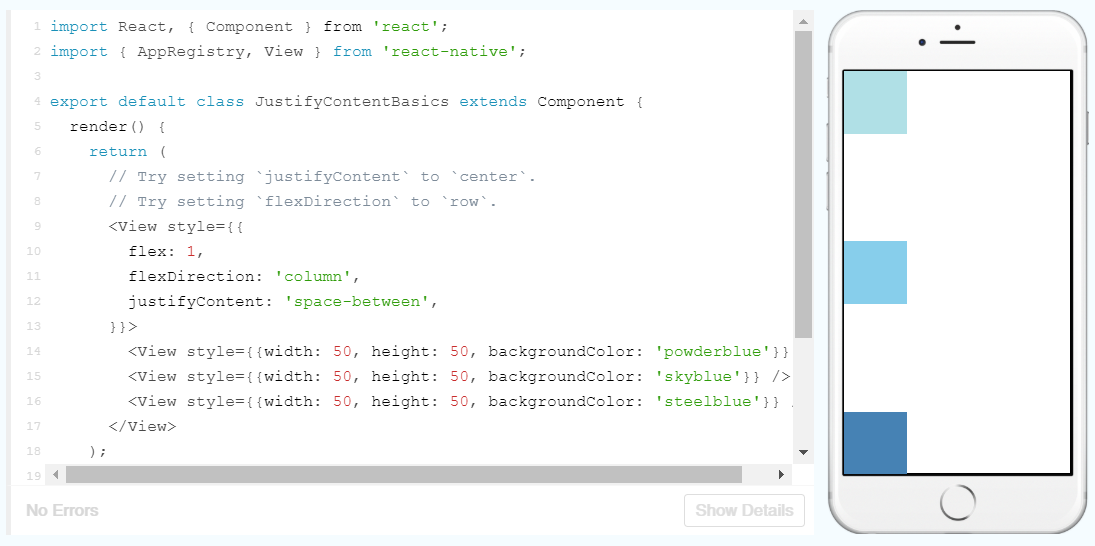
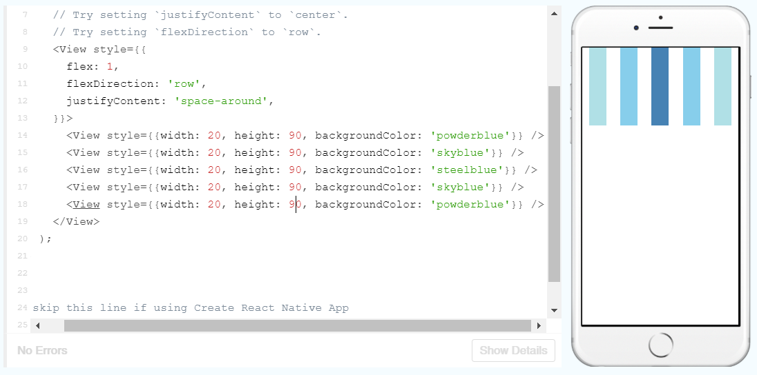
In the example above, justifyContent is set to space-between, so the boxes are spread evenly. It can be also used to center the boxes or create space around them like so:
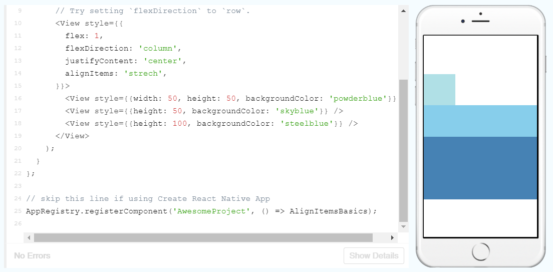
alignItems works in a very similar way, but it also has the option of the properties stretch and baseline. stretch will stretch the children of a container to fill the height of the cross axis. So as long as the width is not defined in boxes in a column, they will be stretched to fill the whole width of the container.
baseline will align the children along a common baseline like in the following:
This can be further manipulated by using alignSelf on individual children, like so:
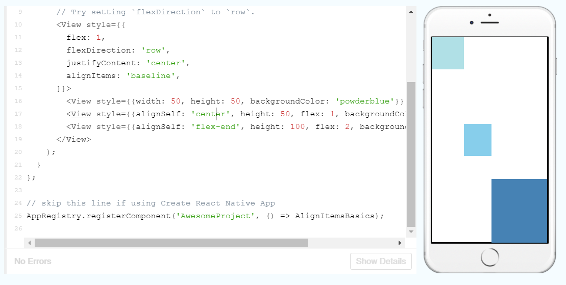
Here, I moved one box to the center and the other to the end of the cross axis. Note how the centre box still retains the same width, despite being set using flex and no longer being in contact with the other boxes. This shows how the flex properties are set by the parent container and not he children.
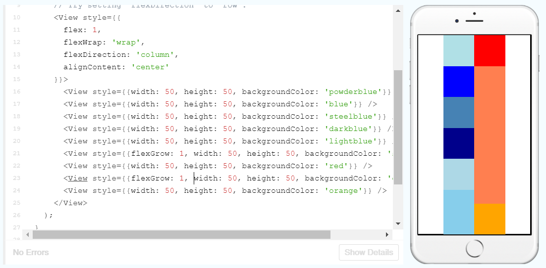
If you have too many items in a row or columns, flexWrap, can be used to wrap the overflowing items into a new row or column. alignContent can then be used to define how multiple rows or columns are aligned.
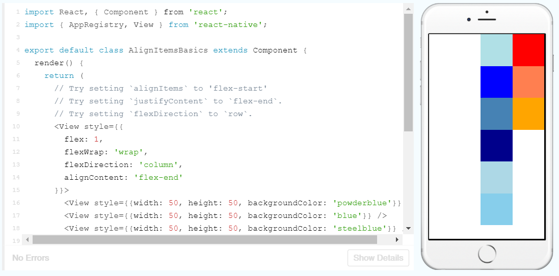
Here I’ve created enough boxes so that one column would go over the bottom edge of the screen. I’ve added flexWrap so that the overflowing boxes are added into another column and then aligned these to the end of the cross axis.
Another flex property, flexGrow, can be used to fill in the extra whitespace in each column. If I add flexGrow to one or multiple boxes, they remaining empty space in the column will be distributed between the boxes with the property.
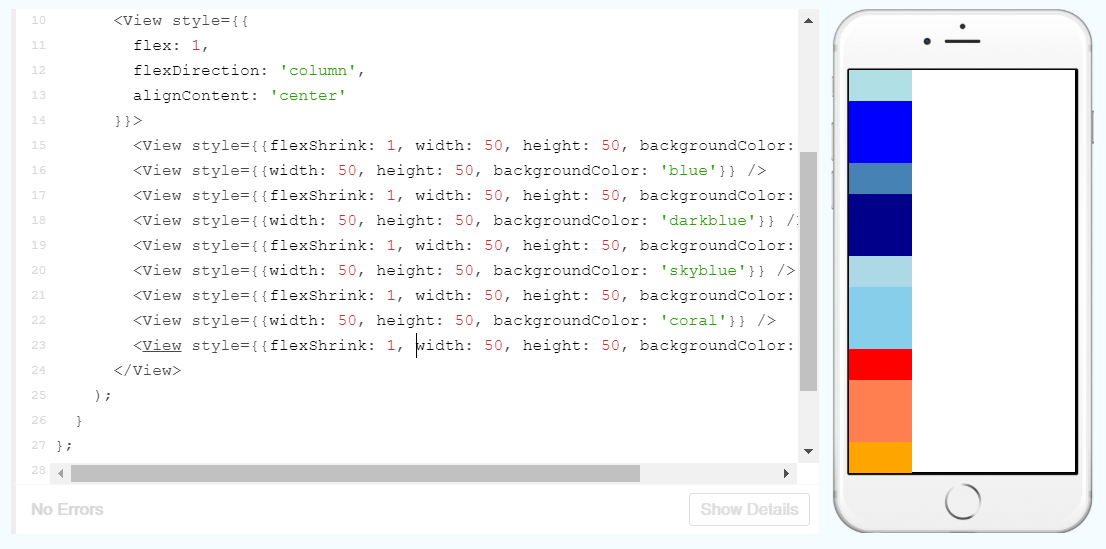
The opposite of this would be flexShrink which will shrink a child if there is an overflow.
position is by default, set to relative which means that it will be positioned according the normal layout, but this can be offset with top, right, bottom and left.
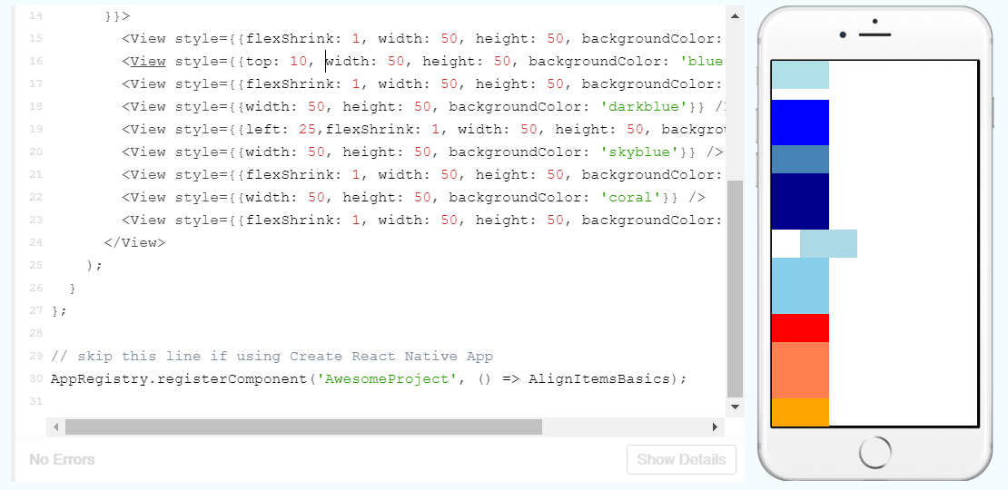
However, position can also be set to absolute, meaning that you can position it independently of its siblings.
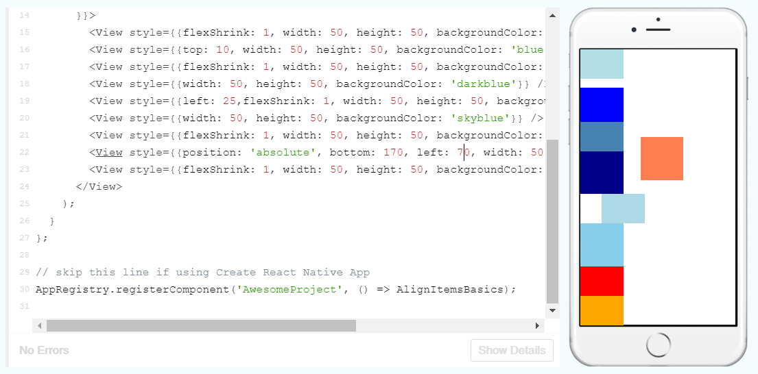
It is interesting to see that if one child is positioned absolutely, the other siblings do not take it into account when deciding their own relative positions.
Text Input
Let’s start with the example given:
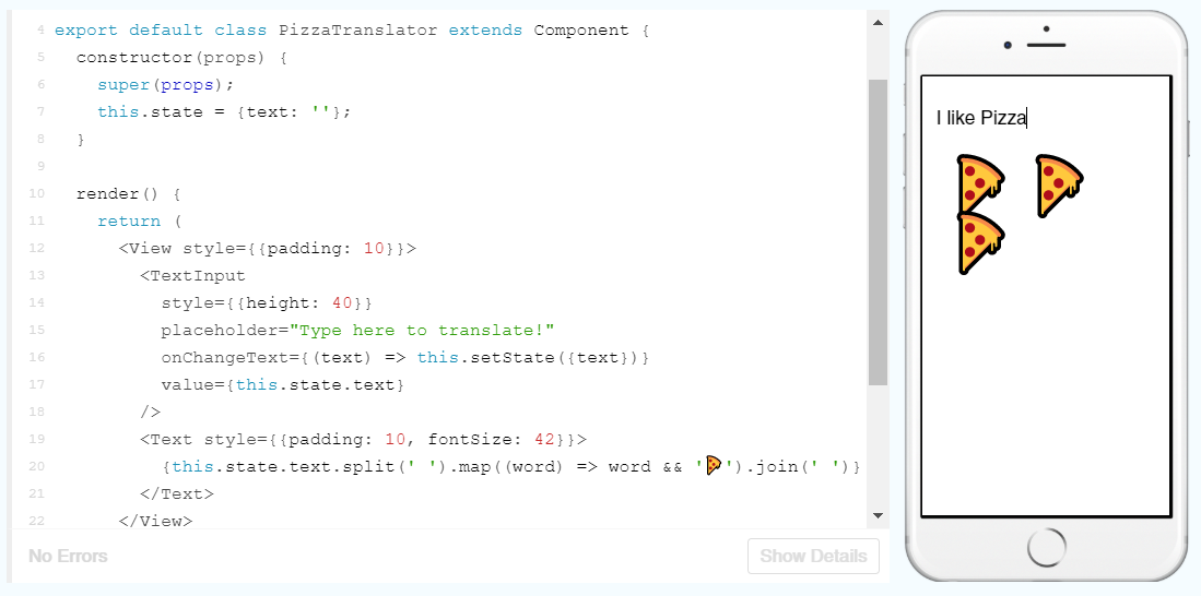
There’s quite a few new things being thrown around here, so I’ll break them down:
export default class PizzaTranslator extends Component {
  constructor(props) {
    super(props);
    this.state = {text: ''};
  }
This first class PizzaTranslator is being created and extending the Component class. The constructor method is being used to set some default properties for the class and props is passed from constructor to super to bring the information about props from the parent class to the new class (you can’t use this.props without doing this). Then the text state is being set to an empty string.
  render() {
    return (
      <View style={{padding: 10}}>
        <TextInput
          style={{height: 40}}
          placeholder="Type here to translate!"
          onChangeText={(text) => this.setState({text})}
          value={this.state.text}
        />
        <Text style={{padding: 10, fontSize: 42}}>
          {this.state.text.split(' ').map((word) => word && '🍕').join(' ')}
        </Text>
      </View>
    );
  }
}
This is rendering a TextInput element and Text element. Within TextInput there is a placeholder, which is the grey text you see before typing something in the box; and onChangeText which is updating the text state to whatever is in the text box.
The Text element is taking the value of this.state.text and splitting the string at each space (so splitting it into single words), then it is mapping each word to a pizza symbol and joining these pizza symbols back together with a space in between.
Now we know how it works, we can play around with the settings:
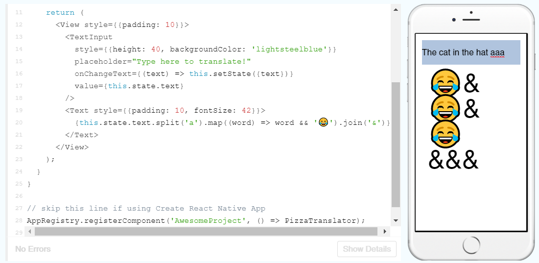
Here I’ve switched the pizza to another emoji and split the string at every ‘a’ and joined them with an ‘&’ symbol instead. Weirdly, though, it is producing an ‘&’ symbol for each ‘a’ rather than just joining the emojis by a single ‘&’. I’m not sure why this is, I can only guess that it is because it is still trying to split the three a’s, but as it is not given a word in between them, it is not returning an emoji between each ‘&’.
I’m getting near the end of the React Native tutorial now, so I will finish it in Part 3!
 Understanding Digital Health