
In the final post regarding following the React Native tutorial, I’ll be taking a look at how to make apps interactive through buttons and other touch screen interactions.
Buttons
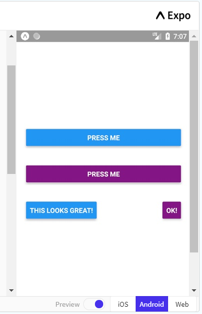
First up, and probably the most important piece of interactivity, is buttons. As with the rest, it’ll be easiest to begin by walking through the example:
And here’s the code:
import React, { Component } from 'react';
import { Alert, AppRegistry, Button, StyleSheet, View } from 'react-native';

export default class ButtonBasics extends Component {
  _onPressButton() {
    Alert.alert('You tapped the button!')
  }

  render() {
    return (
      <View style={styles.container}>
        <View style={styles.buttonContainer}>
          <Button
            onPress={this._onPressButton}
            title="Press Me"
          />
        </View>
        <View style={styles.buttonContainer}>
          <Button
            onPress={this._onPressButton}
            title="Press Me"
            color="#841584"
          />
        </View>
        <View style={styles.alternativeLayoutButtonContainer}>
          <Button
            onPress={this._onPressButton}
            title="This looks great!"
          />
          <Button
            onPress={this._onPressButton}
            title="OK!"
            color="#841584"
          />
        </View>
      </View>
    );
  }
}

const styles = StyleSheet.create({
  container: {
   flex: 1,
   justifyContent: 'center',
  },
  buttonContainer: {
    margin: 20
  },
  alternativeLayoutButtonContainer: {
    margin: 20,
    flexDirection: 'row',
    justifyContent: 'space-between'
  }
});
The example begins with the creating of the ButtonBasics class. It immediately defines the action when a button is pressed, which is to produce an alert. This is followed by the rendering of the buttons on the page. The onPress property tells the button to run the following code upon being pressed and in this case it is referring to the _onPressButton defined earlier in the code. title refers to the text on the button and you can also define the colour of the button.
You’ll notice that each button has a specified style as well. These have all been defined in the stylesheet at the bottom so that the same style properties only have to be called once, optimising the code and making it easier to read and change.
Most of the other components and props will have been covered over the past two posts, but that is the gist of it. Knowing this, I had a bit of a play around to see what I could get the buttons to do. I gave each button one the the four following actions:
export default class ButtonBasics extends Component {
 constructor(props){
   super(props),
    this.state = {numPresses: 0, backgroundColor: 'white'}
 }
  addOne = () => {
    this.setState(prevState => ({numPresses: prevState.numPresses + 1}))
  }

 minusOne = () => {
    this.setState(prevState => ({numPresses: prevState.numPresses - 1}))
  }

  buttonAlert() {
    Alert.alert('You pressed the button!')
  }

  changeBackground = () => {
    if(this.state.backgroundColor === 'white') {
    this.setState({backgroundColor: 'lightsteelblue'})
    }
    else if(this.state.backgroundColor === 'lightsteelblue'){
    this.setState({backgroundColor: 'lightcoral'})
    }
    else{
    this.setState({backgroundColor: 'white'})
    }
  }
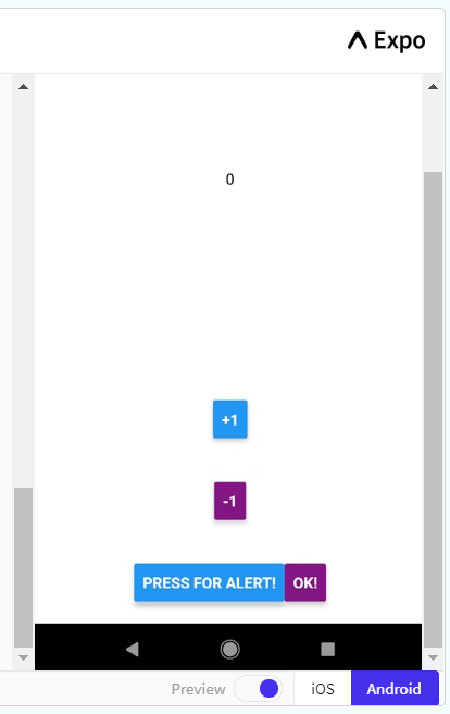
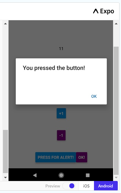
As you can see, I began by setting some states of the background and a counter that I’ve called numPresses. To change the counter, I created two actions for the buttons, one to add 1 and one to subtract 1. Both of these make use of the previous state of numPresses add or subtract 1, and then set the new number as the new state of numPresses.
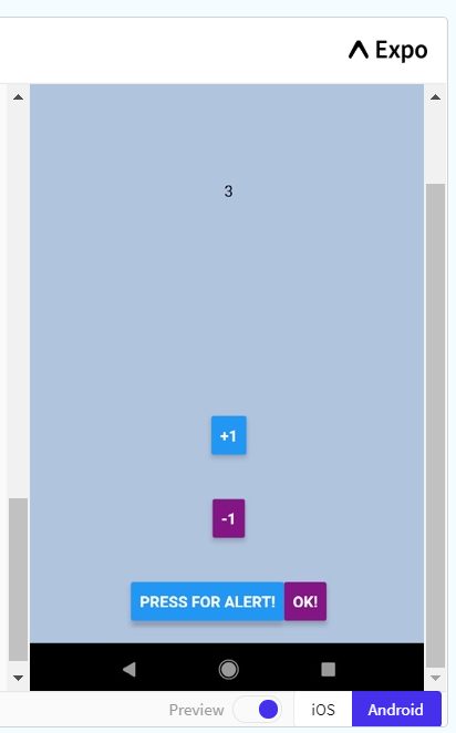
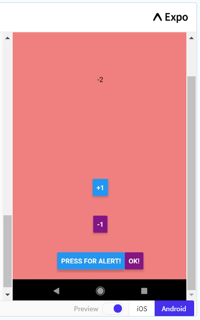
I’ve only changed the name of the alert, so that it’s easier to know what the button is doing now that there are four actions. Finally, the last action makes use of the background colour state that I set. Using some if else statements, the button will change the background colour to blue, then if it is pressed again, the colour will change to red, and then back to white. I’m sure that there is probably an easier way to do this though.
This doesn’t mean anything unless I change the button actions, so here is the rest of the code:
  render() {
    return (
      <View style={styles.container} backgroundColor={this.state.backgroundColor}>
       <View style={styles.container}>
        <Text>
          {this.state.numPresses}
        </Text>
       </View>
        <View style={styles.buttonContainer}>
          <Button
            onPress={this.addOne}
            title="+1"
          />
        </View>
        <View style={styles.buttonContainer}>
          <Button
            onPress={this.minusOne}
            title="-1"
            color="#841584"
          />
        </View>
        <View style={styles.alternativeLayoutButtonContainer}>
          <Button
            onPress={this.buttonAlert}
            title="Press for Alert!"
          />
          <Button
            onPress={this.changeBackground}
            title="OK!"
            color="#841584"
          />
        </View>
      </View>
    );
  }
}
Firstly, I’ve added the counter into the View so that you can see it. I put the state within a Text component and centered it on the screen. The rest of it is very similar apart from changing the onPress action and the title of the buttons to represent what they do.
The output looks like this currently:
And here’s some examples of what the buttons do:
Scrolling
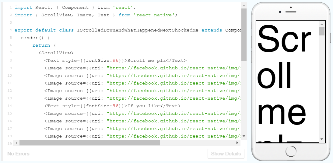
React Native makes scrolling an absolute breeze to implement. All you have to do is use the ScrollView component which acts a a View container, but when the container is longer than the page, it lets you scroll. Simple!
Here is the example:
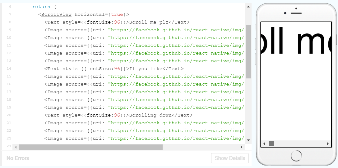
By simply adding the horizontal prop to the ScrollView we can also scroll horizontally like so:
And that’s it! Now that the tutorial is finished with, I can start learning a bit more about react native and expo to design and implement a pedometer app!
 Understanding Digital Health