
As mentioned previously, to build this app, I will be using the programming language React Native and a development kit called Expo.
I’ve already gone ahead and set up my app project using Expo and this is the current state of it:
To implement the accelerometer, I am actually going to beginning by removing the code that is already present and replace it with the basic accelerometer code from the Expo website. I’ll put the code here as well and walk through it:
import React from 'react';
import { StyleSheet, Text, TouchableOpacity, View } from 'react-native';
import { Accelerometer } from 'expo-sensors';

export default class AccelerometerSensor extends React.Component {
  state = {
    accelerometerData: {},
  };

  componentDidMount() {
    this._toggle();
  }

  componentWillUnmount() {
    this._unsubscribe();
  }

  _toggle = () => {
    if (this._subscription) {
      this._unsubscribe();
    } else {
      this._subscribe();
    }
  };

  _slow = () => {
    Accelerometer.setUpdateInterval(1000);
  };

  _fast = () => {
    Accelerometer.setUpdateInterval(16);
  };

  _subscribe = () => {
    this._subscription = Accelerometer.addListener(accelerometerData => {
      this.setState({ accelerometerData });
    });
  };

  _unsubscribe = () => {
    this._subscription && this._subscription.remove();
    this._subscription = null;
  };

  render() {
    let { x, y, z } = this.state.accelerometerData;
    return (
      <View style={styles.sensor}>
        <Text>Accelerometer:</Text>
        <Text>
          x: {round(x)} y: {round(y)} z: {round(z)}
        </Text>
        <View style={styles.buttonContainer}>
          <TouchableOpacity onPress={this._toggle} style={styles.button}>
            <Text>Toggle</Text>
          </TouchableOpacity>
          <TouchableOpacity onPress={this._slow} style={[styles.button, styles.middleButton]}>
            <Text>Slow</Text>
          </TouchableOpacity>
          <TouchableOpacity onPress={this._fast} style={styles.button}>
            <Text>Fast</Text>
          </TouchableOpacity>
        </View>
      </View>
    );
  }
}

function round(n) {
  if (!n) {
    return 0;
  }

  return Math.floor(n * 100) / 100;
}

const styles = StyleSheet.create({
  buttonContainer: {
    flexDirection: 'row',
    alignItems: 'stretch',
    marginTop: 15,
  },
  button: {
    flex: 1,
    justifyContent: 'center',
    alignItems: 'center',
    backgroundColor: '#eee',
    padding: 10,
  },
  middleButton: {
    borderLeftWidth: 1,
    borderRightWidth: 1,
    borderColor: '#ccc',
  },
  sensor: {
    marginTop: 45,
    paddingHorizontal: 10,
  },
});
Expo has it’s own APIs for accessing the phone sensors and you can see that the Accelerometer API has been imported from the expo-sensors packgage.
There’s plenty of code that I haven’t come across before yet, so I’m going to work though it and explain how it works.
The state accelerometerData is created for future use. This state of this will reflect the current data that the accelerometer is outputting.
componentDidMount will run automatically when the parent component is mounted. So basically, when the app starts up, it will run whatever code follows it, in this case this._toggle (which I will come to later).
Conversely, componentWillUnmount is automatically run just before a component is unmounted. So in this case, when the component is unmounted, this._unsubscribe will run. This is a good place to stop code running in the background if the component is no longer mounted and being rendered.
The function _toggle is created and states that if this._subscription returns true, then run this._unsubscribe. Otherwise, run this._subscribe. In other words, it toggles the subscription on or off.
_slow and _fast are functions to change how often the accelerometer updates (measures the current acceleration) in milliseconds.
Within the _subscribe function _subscription is an object that is being assigned a listener for the accelerometer. The listener will be given the x, y and z values from the accelerometer every time the accelerometer is updated. In this case, accelerometerData is the listener and it will update the state of itself every time it is given new values.
_unsubscribe is removing the listener from _subscription and subsequently assigning it a null value. The way the && (logical AND operator) works is that it will evaluate left to right and will stop at the first false value. Therefore if this._subscription is false, it will not go on to remove the listener (which is good as there is probably nothing to remove if this is the case).
Next there is the render. You’ll notice just inside the render, but before return, a variable is being created which is holding the current state of accelerometerData. This isn’t 100% necessary as you can just put the state of accelerometerData as text, but if you want to do anything to the variables, like rounding the numbers, it is useful.
The code goes on to show the current accelerometer reading, as well as create some buttons with the _toggle, _slow and _fast functions that were created earlier.
After that, a new function called round is created. This function takes a number and if the argument given is not a number, it returns 0. Otherwise, it multiplies the number by 100 before rounding it down to the nearest integer (this is the function of Math.floor) and then dividing by 100 again, essentially rounding it down to two decimal places.
Finally we have the stylesheet, which I have covered previously.
Here is the visual output of the code:
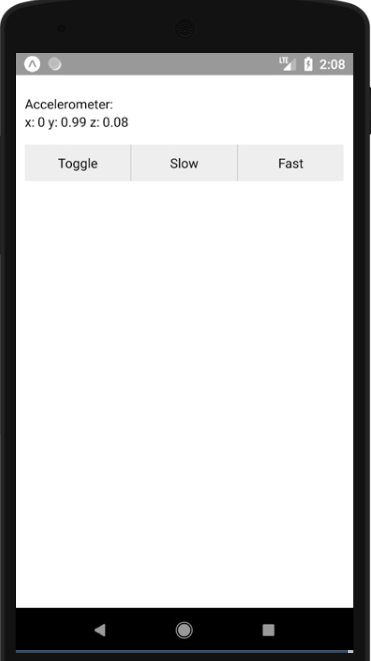
Just as I explained about the code, pressing the toggle button stops the accelerometer data updating, slow makes it update less often (once per second) and fast makes it update more often (60 times per second).
I had a play around with the UI to make it look more appealing and ended up with this:
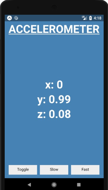
To achieve this, I had to play around with the stylesheet quite a bit and restructure the render and return slightly by creating a few more View components around the text so that I could separate their styles. I haven’t touched any of the button press functions yet.
  render() {
    let { x, y, z } = this.state.accelerometerData;
    return (
      <View style={styles.sensor}>
        <View style={styles.accelerometerReadingBox}>
          <Text style={styles.accelerometerHeading}>ACCELEROMETER</Text>
        </View>
        <View style={styles.accelerometerReadingBox}>
            <Text style={styles.accelerometerReadingText}>
             x: {round(x)}
           </Text>
           <Text style={styles.accelerometerReadingText}>
             y: {round(y)}
           </Text>
           <Text style={styles.accelerometerReadingText}>
             z: {round(z)}
           </Text>
        </View>
        <View style={styles.buttonContainer}>
          <TouchableOpacity onPress={this._toggle} style={styles.button}>
            <Text>Toggle</Text>
          </TouchableOpacity>
          <TouchableOpacity onPress={this._slow} style={[styles.button, styles.middleButton]}>
            <Text>Slow</Text>
          </TouchableOpacity>
          <TouchableOpacity onPress={this._fast} style={styles.button}>
            <Text>Fast</Text>
          </TouchableOpacity>
        </View>
      </View>
    );
  }
}
As you can see, within the View with the sensor style, I separated the accelerometer reading and buttons into difference View components. Then within the accelerometer reading View I separated the heading and values into separate View components too.
Within that again, I separated the accelerometer values into different Text components so that they appear as a column.
Other than that, the only differences that you may notice are the different styles that everything now has, so I’ll show you the new stylesheet too.
const styles = StyleSheet.create({
  buttonContainer: {
    flex: 0.2,
    flexDirection: 'row',
    alignItems: 'center',
    margin: 15,
  },
  button: {
    flex: 1,
    justifyContent: 'center',
    alignItems: 'center',
    backgroundColor: '#eee',
    padding: 10,
  },
  middleButton: {
    marginLeft: 10,
    marginRight: 10,
    borderColor: '#ccc',
  },
  sensor: {
    paddingTop: StatusBar.currentHeight,
    backgroundColor: 'steelblue',
    flex: 1,
  },
  accelerometerReadingBox: {
    flexGrow: 1,
    alignItems: 'center',
  },
  accelerometerReadingText: {
    fontSize: 40,
    fontWeight: 'bold',
    color: 'white',
    justifyContent: 'center',
  },
  accelerometerHeading: {
    fontSize: 40,
    fontWeight: 'bold',
    color: 'white',
    textDecorationLine: 'underline',
    justifyContent: 'flex-start',
I’ve changed the stylesheet, quite a bit to make the app look how it does now. Firstly, you’ll notice that the buttonContainer now has flex of 0.2. This is because I separated the buttons and accelerometer readings into their own components, so I had to define what size I wanted the relative to each other and I only want the buttons to take up a small amount of the page at the bottom. I also changed their alignment to the centre too.
For the middleButton, I removed the border and added a small left and right margin to separate the three buttons.
I have also changed the top padding for the sensor style which is used in the main View of the whole app. I imported the StatusBar component at the top of the code and used the height prop so that the padding will automatically change to the status bar height of the phone it is on. Also, I obviously have changed the background color of the app, which is implemented here.
Then we get to the accelerometer reading styles. I used flexGrow here so that it fills the available space. All of the components have been set so that they sit in the centre of the screen horizontally and the heading is set to be at the top of the screen (flex-start), with the values in the vertical centre of the screen too. Other than that, I have simple changed the font using the size weight (boldness) and decoration (underline) styles.
Now that I have a working accelerometer app that looks at least slightly better, I need to work out how to store the data it produces, which is what the next post will be all about!
 Understanding Digital Health